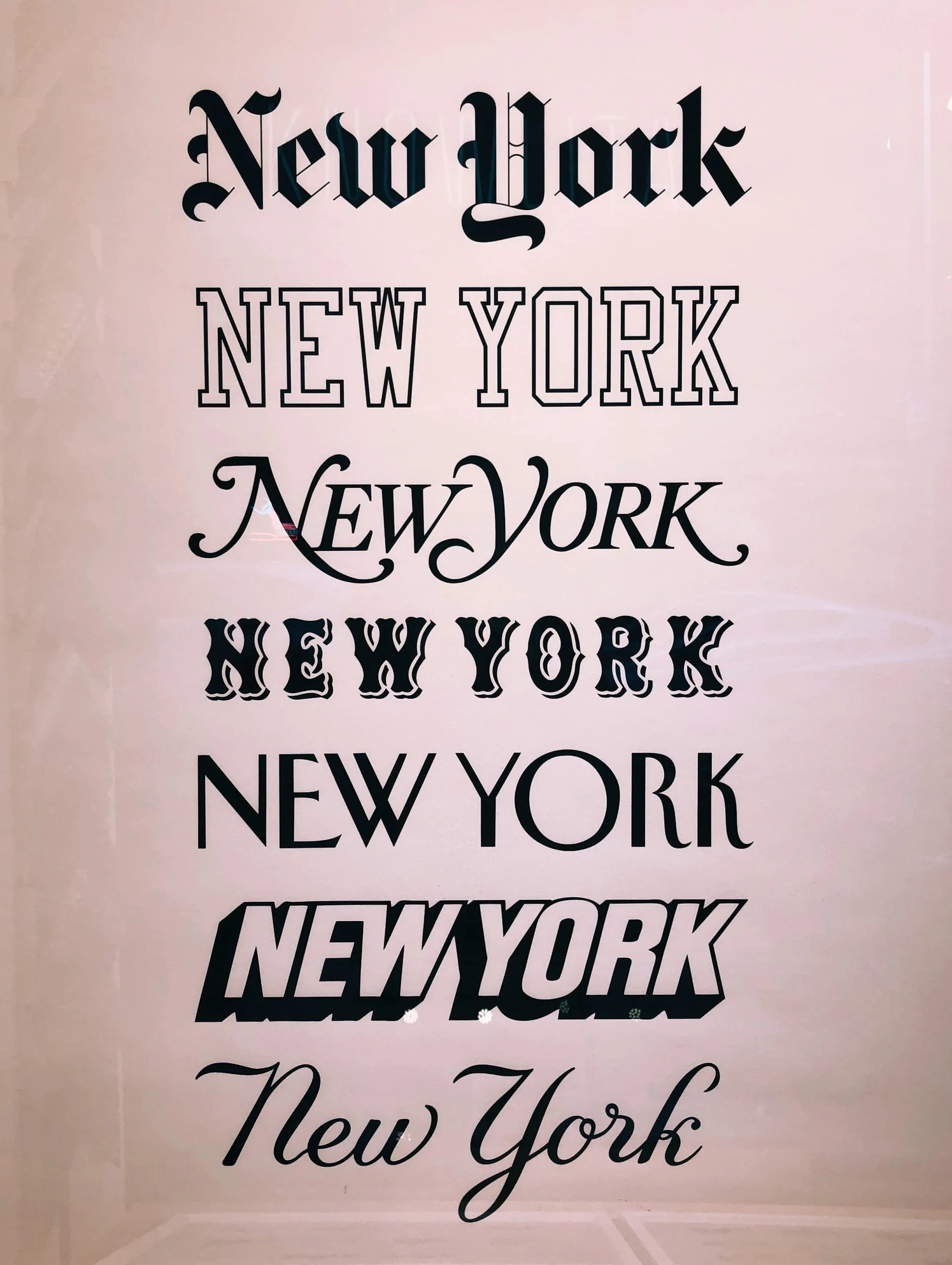
Web Typography That Works: Maximize Your Website’s Potential
You know your business inside and out. Your products and services are second to none. Your website is the digital face of your company, so
Typography rules refer to the typography and styles you choose for your communications.
Typography says a lot about your brand, so choose your styles wisely.

You know your business inside and out. Your products and services are second to none. Your website is the digital face of your company, so

You know your business inside and out. Your products and services are second to none. Your website is the digital face of your company, so

You know your business inside and out. Your products and services are second to none. Your website is the digital face of your company, so
Typography is more than just choosing a pretty font. It’s an essential part of the brand design, experience, and visibility.
Furthermore, good typography rules establishes a strong visual hierarchy, is practical and unique. Also, it is easier to read and provides graphic balance while setting the tone of your voice.
For example, GAP’s consistent use of the best typography is a crucial part of its visual identity system. What's more, like the clothing they make, Helvetica Neue has a crisp, clean, contemporary feel, good depth in all applications, and holds up well in different media.
Also, there are thousands of fonts to choose from, like the ever-popular serif fonts. However, to get your message across successfully, you need to connect design, purpose, and technicality. Hence, with the right typography rules, you can achieve excellent results.

When in doubt, set your type to justify left rag right. Why? In western culture, people read from top to bottom, left to right. Thus, by justifying type left, the eye can find the edge and read the copy much more easily. Also, this will help you achieve the best typography.
Also, go from light to bold, or from medium to extra bold when changing font weights. The key to great design is contrast. Although, slight changes in weight change make it harder for the audience to notice the difference. In addition, to achieve the best typography, try mixing bold for the headline and light for the body copy for greater contrast.
In addition, use rules/lines to group related blocks of information. This will also make dissimilar objects appear more orderly. Likewise, you will remain consistent with your typography rules.
What’s more, using two fonts successfully within a layout requires an understanding of the chosen fonts in order to be confident that they are complementary. In general, avoid using two fonts of the same classification. For example, do not use two sans serif, serif, slab serif or script faces together. The reason: contrast.
What’s more, a good rule of thumb when changing point sizes, is to double or half the point size you are using. For example, if you are using 30 pt. type for the headline, use 15 pt. type for the body copy. However, for other uses try 3x or 4x the point size for something more dramatic.
The closer things are together, the more the reader will assume a relationship exists between separate blocks of information. Also, typography rules focuses on spacing. Never use forced justified type because of the inherent rivers that will run through your copy. Likewise, avoid having a single word on the last line of a paragraph, otherwise known as widow.
Perfect choice to keep pace with the latest.
